SKU
- Category
- Media / Reward display
- Status
- WIP (wireframe-fidelity)
- Source
- Figma, node 474:10495
- Owner
- Ofek (variations gated on “Ask Ofek Before Use”)
- Number-format author
- Natalia Kornejewa
The SKU is a fixed-square container that displays a reward or currency at one of six preset sizes. It is a presentational component, not a control: it does not respond to input on its own. What the SKU shows (the coin, the card, the booster art) is injected through the skuType slot.
Anatomy
Section titled “Anatomy”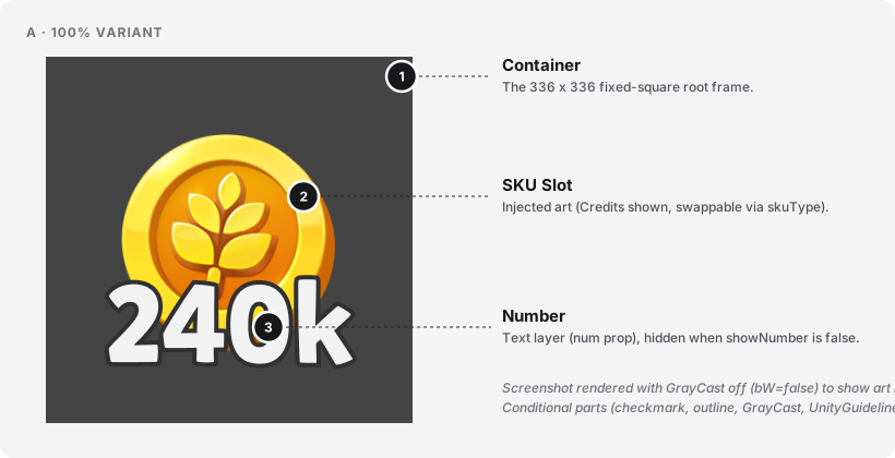
| # | Part | Required | Notes (Figma layer / code slot) |
|---|---|---|---|
| 1 | Container | Yes | Fixed-square root. Figma variant Size=*. Renders overflow: clip. No fill, no border by default (the dark surround visible above is Figma page bleed-through, not part of the component). |
| 2 | SKU Slot | Yes | The instance slot the reward art is injected into. Figma layer SKU Slot (node 474:10498 on 100%). Default sample instance is Credit 1 (a Credits coin). Bound to the skuType slot prop. |
| 3 | Number | No | The reward count text. Figma layer 240k (node 474:10500 on 100%). Rendered when showNumber=true. Not present in the 35% variant at all (structural omission, not a prop). |
Parts not shown in the diagram (hidden by default in Figma or conditional):
- GrayCast. A
#d9d9d9fill layer covering the whole container withmix-blend-mode: color, greying the SKU out. Figma layerGrayCast(node474:10513). Rendered whenbW=true(default). Turned off in the screenshots above so the coin art is visible in color. - SKU Slot Guide. Absolute-centered positioning frame that holds the art. Not visible: the geometric anchor. Figma layer
SKU Slot Guide(node474:10497on 100%). - SKU Slot outline. Alternate slot layer with a stacked drop-shadow outline treatment. Rendered when
outline=true. Figma layerSKU Slot outline(node474:10499on 100%). - checkmark (“Done 5”). Overlay badge marking a claimed SKU. Rendered when
checkmark=true. Baked image with two large box-shadows for the green-glow halo. - UnityGuidelines. Hidden guide frame present only in the 100% variant metadata. 51 px corner brackets defining a Unity safe-area / bleed region. Not rendered; a Unity handoff artifact.
The component has no focus ring and is not a focus target (see Behavior and accessibility below).
Variants & Usage
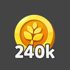
Section titled “Variants & Usage”The one structural axis is Size, with 6 values. Screenshots below show each size with the default Credits art in the slot, no checkmark, no outline, and the “240k” placeholder number. GrayCast (bW=true) is turned off for these renders so the coin art is visible in color. The size variant name carries its intended usage location (e.g. 70% - Big Reward Screen), which is a rare and useful convention.
The tiles in the grid below are not to scale (each tile is the same visual size for easier scanning). For the actual pixel dimensions rendered side by side, see the Sizing section.

336 x 336 px
235.2 x 235.2 px

188.16 x 188.16 px

161.28 x 161.28 px

134.4 x 134.4 px

117.6 x 117.6 px
Reading each size variant’s name as its usage recommendation:
| Size variant | Use when | Do not use when |
|---|---|---|
100% |
Flagship, full-size SKU (a modal hero, a big reward reveal). | Placing multiple SKUs side-by-side in a reward screen (use 70%). |
70% - Big Reward Screen |
Rendering SKUs on a Big Reward screen where the SKU is the primary content. | Use 56% on the Small Reward screen instead. |
56% - SmallReward Screen |
Rendering SKUs on a Small Reward screen. | Use 70% on the Big Reward screen. |
48% - GrandPrize |
Rendering the SKU inside a Grand Prize component. | For a 2nd-hierarchy reward (use 40%). |
40% - 2ndHierarchy |
Second-hierarchy rewards on a screen where a 48% or larger owns the primary slot. |
Running text (use 35%). |
35% - MinRunningText |
The SKU appears in a line of running text (a sentence, a description, a summary). | Anywhere a number should appear on the SKU (the 35% variant does not render the number). |
Anti-patterns:
- Using two different sizes for the same visual weight on one screen. The size variants are hierarchical, not decorative.
- Applying
checkmark=truewithbW=trueunless the semantic is intentionally “claimed + still locked to further interaction” ([TODO: confirm with Ofek]). - Using the SKU as a tappable primary control without wrapping it in an accessible button / link. The SKU itself has no focus ring and no keyboard behavior.
Sizing
Section titled “Sizing”The six sizes shown at their actual pixel dimensions, bottom-aligned so the size ladder reads at a glance.
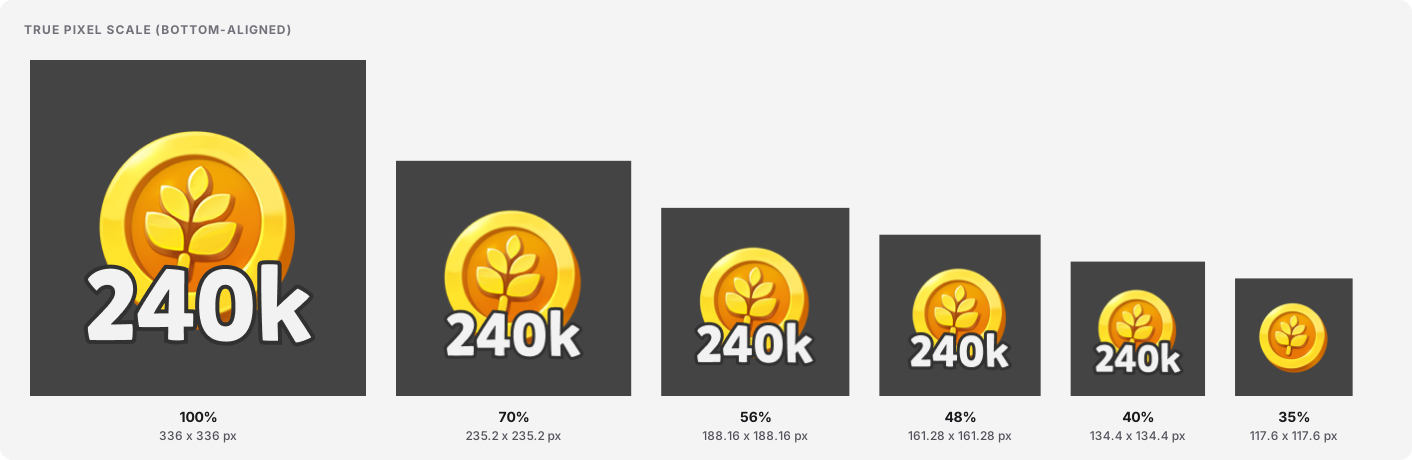
Measured dimensions per size variant. All values read from Figma on 2026-09-02.
| Size variant | Container (px) | Slot / art frame (px) | Number shown? | Font size for number |
|---|---|---|---|---|
100% |
336 x 336 | 198 x 228 | Yes | 100px DEBT hardcoded |
70% - Big Reward Screen |
235.2 x 235.2 | 138.6 x 159.6 | Yes | 60px DEBT hardcoded |
56% - SmallReward Screen |
188.16 x 188.16 | 110.88 x 127.68 | Yes | 52px (--subtitle) |
48% - GrandPrize |
161.28 x 161.28 | 95.04 x 109.44 | Yes | 44px (--running-text) |
40% - 2ndHierarchy |
134.4 x 134.4 | 79.2 x 91.2 | Yes | 38px (--timer) |
35% - MinRunningText |
117.6 x 117.6 | 69.3 x 79.8 | No (structurally omitted) | n/a |
States
Section titled “States”The state model is expressed through four boolean props, not through named variants. The doc below proposes a semantic mapping. Confirm with Ofek before treating this as final.
| Prop | Default | Layer toggled | Proposed semantic |
|---|---|---|---|
bW |
true |
GrayCast |
bW=true = locked / unavailable · bW=false = available |
checkmark |
false |
Done 5 badge |
checkmark=true = claimed |
outline |
false |
SKU Slot outline (stacked drop-shadow) |
outline=true = selected |
showNumber |
true |
Number text |
showNumber=false = art-only (rarely used) |
One prop combination catch: checkmark=true combined with bW=true is legal in Figma but the semantic (claimed + still greyed?) is undefined. Do not use that combination until Ofek confirms.
Motion
Section titled “Motion”Motion for the SKU is not documented in Figma yet. This section lays out what the runtime probably has to animate, and what a proper motion spec would need to define. It is deliberately short. Fill it in when the specs arrive; do not invent them here.
State of motion for this component. No motion is defined in Figma on this component. The Figma MCP’s get_motion_context returned zero keyframe nodes for the whole subtree (recursive scan on 2026-09-02). There are no prototype connections on the component set either. The three state props (bW, checkmark, outline) all imply runtime transitions in the live product (locked to available should ungrey; claim should reveal the checkmark; select should turn the outline on) but Figma does not specify HOW those animate.
The three implied transitions:
| Trigger | Animated part(s) | Property | Duration | Easing | Reduced-motion behavior |
|---|---|---|---|---|---|
bW: true to false (unlock, or reveal on claim) |
GrayCast |
opacity (fade out), possibly a scale / pop on the underlying art |
[TODO] |
[TODO] |
[TODO] swap instantly, no fade |
checkmark: false to true (SKU is claimed) |
Done 5 badge |
opacity + transform: scale (pop-in), plus the green halo drawing |
[TODO] |
[TODO] |
[TODO] show instantly, no pop |
outline: false to true (SKU is selected) |
SKU Slot outline (the stacked-shadow layer) |
filter or opacity (the four drop-shadows fade in) |
[TODO] |
[TODO] |
[TODO] swap instantly |
Motion contract owed. To close this section out, the design system needs a motion.duration.state-change token, a motion.easing.state-change token, a single documented reduced-motion rule (instant state swap, no animation, when prefers-reduced-motion: reduce is set), and a short note per transition on what animates and what does NOT (never animate the container size, never animate the number’s font-size, both would be jank).
Content rules
Section titled “Content rules”Number formatting, from Natalia Kornejewa, transcribed verbatim from the reference canvas (Figma section “SKUS Component, Published”, node 468:1037).
| Range | Format |
|---|---|
| 1 to 999 | 1 … 999 |
| 1,000 to 999,999 | 1k … 999k |
| 1,000,000 to 999,000,000 | 1m … 999m |
Prefix / template:
- All SKUs except Album Pack:
{0}(the number as-is). - Album Pack:
x{0}(with a leading “x”, e.g.x3).
Other:
- Language / RTL:
[TODO: confirm.]The formatting is numeric so LTR / RTL should be transparent, but thek/msuffixes and the Album Packxprefix need a localization rule. - Truncation / overflow: the number layer is
whitespace: nowrap. Very long strings (unlikely given the formatting cap at 3 characters + suffix) will bleed outside the container. - Casing: suffixes are lowercase
k/mper the reference. No other casing rules.
Behavior and accessibility
Section titled “Behavior and accessibility”This is a decorative / presentational component. It does not respond to input on its own. Interaction (tap-to-claim, tap-to-select) is the responsibility of the parent container that composes SKUs into a reward screen, a collection, or a running-text callout.
- Element / role:
divwithrole="img"and an accessible name.[TODO: confirm with front-end team]whether a semanticfigure+figcaptionis preferred when the number is shown. - ARIA:
aria-labelcomposed fromskuTypename +num+ state ("claimed"whencheckmark=true,"locked"whenbW=true). Concrete pattern[TODO: confirm]. - Keyboard: not focusable in isolation. When wrapped in a claim / select control, the parent owns focus.
- Target size: at
size=35%the container is117.6 x 117.6 px. Well above the WCAG 2.2 minimum (24 x 24 CSS px) and above the 44 x 48 px touch target, IF the SKU itself is tappable. When it is not tappable, the min-target rule does not apply. - Contrast: number text
#f2f2f2on#313131grey-cast is approximately 12.6:1, well over 4.5:1. Contrast on unclamped color art is a property of the injectedskuType, not of this component. - Reduced motion:
[TODO: confirm.]See the Motion section for what has to be specified. - How to test:
[TODO: confirm the test contract with the front-end team.]
Foundations and tokens
Section titled “Foundations and tokens”The tokens Figma reports for this component at its top level. Untokenized values are flagged as DEBT with the token decision that is missing.
| Property | Value | Token name (Figma) | Notes |
|---|---|---|---|
| number text color | #f2f2f2 |
Wireframe Palette/50 |
Primitive (wireframe). Same “Wireframe Palette” the rest of the WIP components use. Not a semantic token yet. |
| outline drop-shadow color | #313131 |
Wireframe Palette/900 - Shadows & Meters |
Primitive (wireframe). Token name carries semantic hint (“Shadows & Meters”) but is still under the primitive palette namespace. |
| font size (56%) | 52px |
Subtitle |
Primitive. Numeric token. Not scoped to SKU. |
| font size (48%) | 44px |
Running text |
Primitive. Numeric token. Not scoped to SKU. |
| font size (40%) | 38px |
Timer |
Primitive. Numeric token. Not scoped to SKU. |
| font size (100%) | 100px |
none | DEBT Hardcoded. Missing token: sku.number.100 (or a shared “display” type token). |
| font size (70%) | 60px |
none | DEBT Hardcoded. Missing token: sku.number.70. |
| font family | Mikado Bold |
none (raw name) | The wireframe font. Should map to a semantic type token, e.g. type.family.display. |
| checkmark halo shadows | two large box-shadows, values scale per size | none | DEBT Uses raw shadows AND scales per size instead of a shared elevation token. |
| GrayCast fill | #d9d9d9 |
none | DEBT Should be a semantic state.locked or state.disabled color-token. |
| slot art inset | -22.06% / -32.11% / -23.68% / -33.03% |
none | Intentional bleed (the coin extends past the slot). Not a token, but consistent across sizes as a percentage. |
Gaps found
Section titled “Gaps found”- Wireframe fidelity. The component sits on the “Wireframe Palette” (
#f2f2f2,#313131) and uses raw type names (Timer,Subtitle,Running text) instead of semantic tokens. The whole component needs a promotion pass into the real palette + type system. - Two hardcoded font sizes.
100px(100%) and60px(70%) are not tokenized. Missing tokens or a shared “display” type ramp. showNumberis inert onsize=35%. The number layer is structurally absent from the 35% variant. Either move the omission to a prop rule (showNumberforced-false on 35%) or add the number layer to 35% and let the prop control it.- State model is implicit.
bW,checkmark, andoutlineare booleans without a documented semantic map. See the States section for the proposed mapping. Confirm with Ofek and give the states named tokens (state.locked,state.claimed,state.selected). bW=trueas default. Ships greyed-out. Reasonable if “locked” is the most common state, worth documenting so consumers do not forget to disable it.- Motion is undefined. No keyframes, no prototype connections, no motion tokens. The three state transitions (unlock, claim, select) all need a spec (duration, easing, reduced-motion behavior). See the Motion section.
- Checkmark halo uses raw box-shadows. The green-halo glow on
Done 5uses hardcodedrgba(0,0,0,0.35)/rgba(0,0,0,0.65)values that scale per size. Should be a single elevation token that scales via a formula, not per-size hardcodes. GrayCastuses#d9d9d9raw. No semantic state token.UnityGuidelineslayer is a handoff artifact. Hidden guide-brackets for Unity’s safe-area / bleed sit inside the 100% variant. Fine as an internal reference; document that the frame is not part of the component’s exported API.- SKU Library is stale. Section
SKU Library, Requires updatingis the catalog theskuTypeslot draws from. Its current state is not a contract. Schedule a library-inventory trace as a follow-up build. - Ownership gate. The reference canvas says “Component Variations (Specific component requirements, Ask Ofek Before Use)”. A soft governance rule that is not machine-readable. Formalize it (a
status: gated-variantsfield, or a decision log). - Playtika rendering language check. The
outlinestate is implemented via 4 stacked tiny-blur drop-shadows to fake a stroke. That aligns with the house rule (hierarchy via outlines / containers, not web-style shadows): good. Worth documenting explicitly so future variants do not slip into single-shadow “web” outlines. Timer,Running text,Subtitleare numeric font-size tokens that carry a usage hint in their name. Same “naming carries usage” pattern the size variants use. Elevate the pattern to a documented convention (or refactor totype.size.*with a separate usage table).