Card
- Category
- Container / Reward display
- Status
- WIP (wireframe-fidelity)
- Source
- Figma, node 474:9293
- Owner
- Ofek (variations gated on “Ask Ofek Before Use”)
- Composes
- SKU, CtaButton (undocumented)
The Card is a rounded-rectangle container that groups one or more SKUs with a single call-to-action pill. It exists in four sizes (Small, Medium, Large, Wide) and four states (Active, Default, Inactive, Completed). Unlike the SKU, which is presentational, the Card carries interaction: the CTA at the bottom is the tap target that unlocks, buys, or claims the rewards shown up top.
Anatomy
Section titled “Anatomy”Numbered callouts on the CardMedium Default variant. GrayCast on the SKU instances is left as the code default (greyed wireframe fidelity) so the callouts match what a builder sees when they drop the component into a canvas.
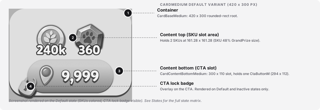
| # | Part | Required | Notes (Figma layer / code slot) |
|---|---|---|---|
| 1 | Container | Yes | Rounded-rectangle root. Figma layer CardBase[Size] (474:9301 on Medium). Renders a single Rectangle 5954 background at full width and height. A hidden InnerFrame layer sits inside at 16px inset (388 x 168 on Medium); it is not rendered and appears to be a legacy content-guide. |
| 2 | Content top (SKU slot area) | Yes | The top content area. Figma layer Card[Size]Content (474:9302 on Medium). Holds 1 to 3 SKU instances depending on size. On Medium: 2 SKU instances at 161.28 x 161.28 px each (the SKU component’s 48% - GrandPrize size, side by side, gap 8 px). |
| 3 | Content bottom (CTA slot) | Yes | The bottom content area. Figma layer CardContentBottom[Size] on Small and Medium, ContentBottom[Size] on Large and Wide (naming inconsistency, see Gaps). Holds one CTA button instance (CtaButton[Size]). Medium slot is 300 x 110 px, CTA is 294 x 112 px. |
| 4 | CTA lock badge | No | A small lock overlay on the CTA at bottom-left. Rendered on the Default and Inactive states. Not present on Active or Completed. [TODO: confirm the badge is part of the CtaButton component's own state, not a Card-level overlay.] |
Parts not shown in the diagram (hidden by default in Figma or conditional):
SKU/44% - 2ndHirerchyplaceholder. A hidden 144 x 144 px SKU instance sits above the top-right of each state variant, outside the card bounds. It appears in the metadata of every state on every size. This is a documentation-canvas artifact, not part of the runtime. Note that44%is not a real SKU size (the SKU component ships 100 / 70 / 56 / 48 / 40 / 35), and2ndHirerchyis misspelled (“Hierarchy”). Both flagged in Gaps.- Completed-state checkmark overlay. In the Completed state, each SKU in the top area renders with
checkmark=true(the green-haloDone 5badge). The overlay lives on the SKU component, not on the Card. See the SKU docs for the checkmark spec.
The Card itself has no focus ring; focus lives on the CTA button (see Behavior and accessibility below).
Variants & Usage
Section titled “Variants & Usage”Two structural axes: Size (4 values) and State (4 values). 16 total variants. Screenshots below show each size in its Active state so the SKUs read in color rather than greyed. The SKU count and layout vary by size:
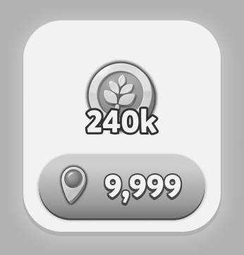
280 x 300 px
1 SKU
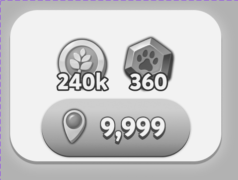
420 x 300 px
2 SKUs
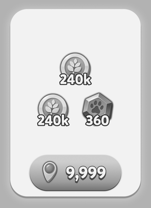
420 x 600 px
1 + 2 SKUs
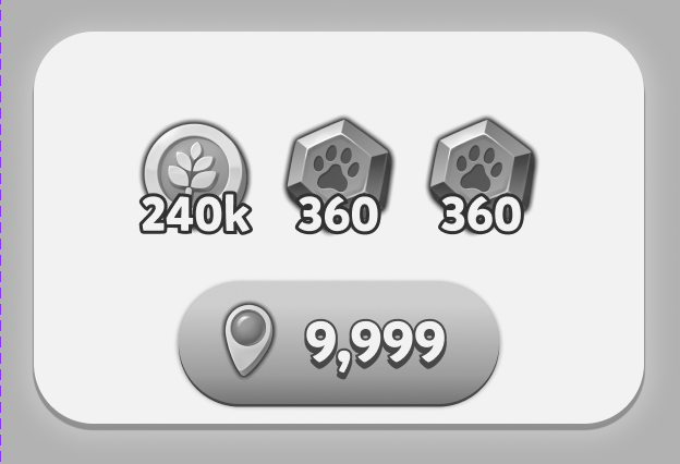
560 x 360 px
3 SKUs
The tiles above are not to scale (each figure is the same visual size for easier scanning). For actual pixel dimensions side by side, see Sizing.
| Size | Use when | Do not use when |
|---|---|---|
Small |
A single reward is being offered and the Card sits in a dense grid or list. | Two or more rewards need equal visual weight (use Medium). |
Medium |
Two rewards of equal weight need to be shown together (a bundle, a paired offer). | The primary reward should dominate visually (use Large). |
Large |
One primary reward should dominate with 1 to 2 secondary rewards below (a headline offer with add-ons). | Rewards are equal-weight (use Medium or Wide). |
Wide |
Three rewards of equal weight need to be shown in one row, and horizontal space is available. | Vertical space is the constraint (use Large). |
Anti-patterns:
- Mixing sizes on the same screen for the same visual weight. The sizes carry hierarchy; use one size per hierarchy tier.
- Placing a CardLarge inside a CardWide or vice versa. Cards are terminal containers, not nestable.
- Using a Card in a Completed state as a live tap target. The Completed state hides the CTA, so there is nothing to tap.
[TODO: confirm the whole Completed Card is inert, not just the CTA.]
Sizing
Section titled “Sizing”The four sizes shown at their actual pixel dimensions, bottom-aligned so the size ladder reads at a glance.
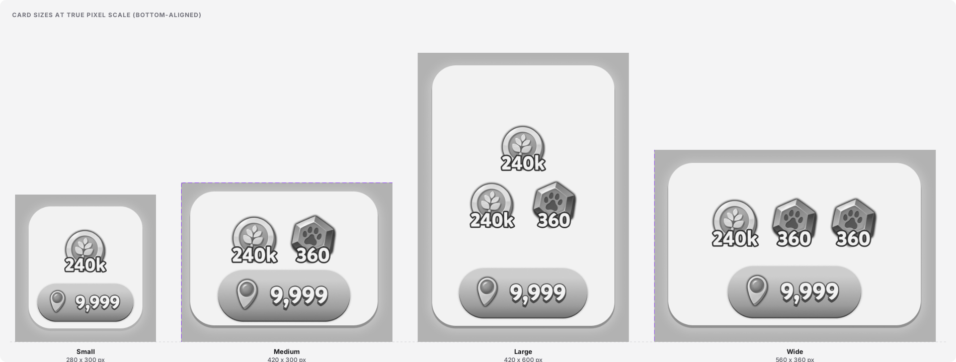
Measured dimensions per size variant. All values read from Figma on 2026-09-03.
| Size | Container (px) | Content top (px) | Content bottom (px) | SKU count (top) | SKU size used |
|---|---|---|---|---|---|
Small |
280 x 300 | 280 x 180 (y=12) | 280 x 110 (y=175) | 1 | [TODO: confirm SKU size in Small] |
Medium |
420 x 300 | 420 x 180 (y=13) | 300 x 110 (y=181) | 2 | 48% - GrandPrize (161.28 x 161.28) |
Large |
420 x 600 | 420 x 340 (y=84) | 420 x 120 (y=464) | 1 primary + 2 secondary | [TODO: confirm SKU sizes in Large] |
Wide |
560 x 360 | 560 x 180 (y=41) | 504 x 110 (y=234) | 3 | [TODO: confirm SKU sizes in Wide] |
Container border-radius, drop-shadow, and padding: [TODO: measure in Figma inspect panel]. The wireframe render suggests roughly 24 to 32 px radius and a small ambient shadow, but neither is a token and neither has been read off the source.
States
Section titled “States”The four states carry the lifecycle of the offer the Card represents. Left to right in the state row below: Active, Default, Inactive, Completed (the Figma variant enum order). Shown here on CardMedium.

| State | Container tone | SKU render | CTA | Proposed semantic |
|---|---|---|---|---|
Active |
Brightest (Wireframe Palette/50) with soft elevation |
Color (bW=false) |
Enabled, no lock (CtaButtonActive) |
The Card is unlocked, the CTA is the primary next step. |
Default |
Near-white (Wireframe Palette/50) |
Color (bW=false) |
Enabled visually, but a small lock badge sits at bottom-left of the CTA (CtaButtonActive) |
Preview state, the CTA is present but gated. [TODO: confirm the semantic difference between Active and Default with Ofek.] |
Inactive |
Mid-grey (Wireframe Palette/600) |
Colored (bW=false), but muted by the darker background |
Locked (CtaButtonDisabled) with lock badge |
The Card is unavailable, no interaction possible. |
Completed |
Darkest (Wireframe Palette/800 on top of 900) |
checkmark=true (Done 5 overlay) |
Absent | The offer has been claimed. |
Motion
Section titled “Motion”Motion for the Card is not documented in Figma yet. This section names the runtime transitions the Card almost certainly needs, without inventing values.
State of motion for this component. No motion is defined in Figma on this component. The Figma MCP’s get_motion_context (recursive) returned zero keyframe nodes for the whole Cards components subtree (2026-09-03). There are no prototype connections. This is the second WIP component in a row to ship without motion tokens (SKU was the first). Escalate as a system-level gap.
The four implied transitions (all currently unspecified):
| Trigger | Animated part(s) | Property | Duration | Easing | Reduced-motion behavior |
|---|---|---|---|---|---|
State: Default to Active (unlock happens, CTA becomes tappable) |
CTA lock badge, container tone | opacity on the badge, background-color on the container |
[TODO] |
[TODO] |
[TODO] swap instantly, no fade |
State: any to Inactive (Card is locked) |
container tone, CTA | background-color, CTA switches to CtaButtonDisabled |
[TODO] |
[TODO] |
[TODO] swap instantly |
State: any to Completed (offer claimed) |
SKU checkmarks (each SKU animates its own checkmark=true), CTA (fades out) |
opacity on CTA, per-SKU checkmark pop-in |
[TODO] |
[TODO] |
[TODO] show instantly, no pop |
| CTA press (within a state) | CTA container | [TODO: read from CtaButton component when it is documented] |
[TODO] |
[TODO] |
[TODO] |
Motion contract owed. The Card needs motion.duration.state-change and motion.easing.state-change tokens (shared with SKU), a documented reduced-motion rule (prefers-reduced-motion: reduce swaps instantly, no fade or pop), and one note per transition on what does NOT animate: never the container size, never the SKU art itself, never the CTA text.
Content rules
Section titled “Content rules”- CTA label. The CTA reads the reward count from the offer (in the wireframe,
9,999with a location-pin icon). Format follows Natalia Kornejewa’s SKU number rules:1to999as-is,1kto999kin thousands,1mto999min millions.[TODO: confirm the CTA number and the SKU number can use the same formatter, or whether the CTA has its own.] - SKU content. Each SKU slot in the top area is a full SKU instance and follows SKU content rules (see SKU content rules).
- Language / RTL:
[TODO: confirm.]The CTA icon (location pin) is directional and would need mirroring for RTL. The lock badge and checkmark are non-directional. - Truncation / overflow: the CTA pill has fixed width per size. Very long numbers (beyond the
999mcap) will overflow.[TODO: confirm truncation rule with front-end.] - Casing: number suffixes lowercase (
k/m), matching SKU.
Behavior and accessibility
Section titled “Behavior and accessibility”The Card is an interactive container. Interaction lives on the CTA button at the bottom; the container itself is not a tap target.
- Element / role: the Card is a
div(orsection). The CTA is abuttonelement.[TODO: confirm with front-end team whether the whole Card is wrapped in a link/button when the CTA is the only action, so the entire surface is tappable.] - ARIA: the Card needs an accessible name composed from the SKUs it contains and its state (
"Active","Locked","Claimed"). Exact pattern[TODO: confirm]. The CTA follows the CtaButton component’s own a11y contract, which is not yet documented. - Keyboard: Tab moves focus to the CTA when the state is
Active. OnDefaultandInactivethe CTA is not focusable (locked). OnCompletedthere is no CTA, so the Card is skipped in tab order.[TODO: confirm this focus model with front-end.] - Target size: the CTA pill is 294 x 112 px on Medium, well over the WCAG 2.2 minimum (24 x 24 CSS px) and the 44 px touch minimum. The whole Card container is much larger and would exceed target size in any orientation.
- Contrast: wireframe fidelity, using the Wireframe Palette. Real contrast values will land when the Card promotes off the wireframe palette. On the current palette,
#f2f2f2container with#313131shadow text is approximately 12.6:1. - Reduced motion:
[TODO: confirm.]See the Motion section. - How to test:
[TODO: define the test contract with the front-end team.]Suggested checks: (a) keyboard tab lands on the CTA when state isActive, skips whenInactive, is absent whenCompleted; (b) screen reader announces the SKUs plus the state; (c)prefers-reduced-motionswaps state changes instantly.
Foundations and tokens
Section titled “Foundations and tokens”Variables Figma reports for the Card at the section level (474:9293). Untokenized values are flagged as DEBT with the token decision that is missing.
| Property | Value | Token name (Figma) | Notes |
|---|---|---|---|
| brightest container / text | #f2f2f2 |
Wireframe Palette/50 |
Primitive (wireframe). Same palette as SKU. Not a semantic token yet. |
| light-grey container | #dfdfdf |
Wireframe Palette/200 |
Primitive. Used on the Default state container. |
| mid-grey container | #727272 |
Wireframe Palette/600 |
Primitive. Used on the Inactive state container. |
| dark-grey container | #474747 |
Wireframe Palette/800 |
Primitive. Used on the Completed state container and on the CTA fill. |
| shadow / darkest | #313131 |
Wireframe Palette/900 - Shadows & Meters |
Primitive. Carries a semantic hint in its name but sits under the primitive palette namespace. |
| CTA number font-size | 44 | Running text |
Primitive numeric token. Shared with SKU 48% GrandPrize. |
| SKU number font-size (in Medium) | 52 | SKU Meter |
Primitive numeric token. [TODO: confirm this is the token driving the SKU inside the Card, not just a coincidental match.] |
| CTA style: Active | CtaButtonActive |
(empty value) | Style variable exists but returns an empty value from the Figma API. It is a placeholder token: the CTA component has its own state style, but the variable name is defined so downstream code can bind to it. Flagged as DEBT until the CtaButton component is documented and its variables carry concrete values. |
| CTA style: Disabled | CtaButtonDisabled |
(empty value) | Same. DEBT. |
| container radius | [TODO: measure] |
none | DEBT Hardcoded. Missing token: card.container.radius or a shared radius.container semantic token. |
| container drop-shadow | [TODO: measure] |
none | DEBT Hardcoded. Missing token: elevation.card or a shared elevation.raised. |
| container padding | 16 px (from the hidden InnerFrame at 16 px inset) |
none | DEBT Not tokenized. Missing token: card.container.padding. |
| gap between SKUs (top area) | [TODO: measure] |
none | DEBT Hardcoded. Missing token: card.content.gap. |
Gaps found
Section titled “Gaps found”- Layer naming is inconsistent between sizes. Small and Medium use
CardContentBottom[Size]; Large and Wide useContentBottom[Size](noCardprefix). Small usesCardSmallContentandCardContentBottomSmall; Large usesCardLargeContentandContentBottomLarge. The naming order flips (CardSmallContentvsCardMediumContent) and the prefix drops. Standardize onCard[Size]Contentfor the top area andCard[Size]ContentBottomfor the bottom area, applied to every size. - The
44% - 2ndHirerchyplaceholder is a broken reference. Every state on every size holds a hiddenSKU/44% - 2ndHirerchyinstance at top-right. The SKU component does not have a44%size (it ships 100 / 70 / 56 / 48 / 40 / 35), and2ndHirerchyis misspelled (“Hierarchy”). Remove the placeholder, or replace it with a valid SKU size and fix the spelling. - Active and Default appear to share variables. The Figma variable set for CardMedium/Active is identical to CardMedium/Default. The visible delta is a lock badge on the CTA. Either the two states differ in a way the tokens do not capture (a design gap: promote the delta to a real token), or one of them is redundant (fold into a single state + a
lockedboolean). - The state model is not documented anywhere. Four state variants exist but no semantic map ships with them. The mapping proposed in the States section is a proposal, not a contract. Confirm with Ofek and name the states (
state.active,state.default,state.inactive,state.completed) with tokens that back them. - Wireframe fidelity, same as SKU. The Card sits on the Wireframe Palette and uses raw numeric tokens (
Running text,SKU Meter). Promote to real palette and semantic tokens when the component graduates from WIP. - CTA button not documented. The CTA lives inside the Card and switches between
CtaButtonActive,CtaButtonDisabled, and (implicitly) an absent state on Completed. TheCtaButtoncomponent has no doc page yet. Schedule a follow-up trace onCtaButtonS,CtaButtonM,CtaButtonL,CtaButtonW. - Motion is undefined. No keyframes, no prototype connections, no motion tokens. Four implied transitions (unlock, lock, complete, CTA press) all need spec. Second WIP component in a row (SKU was the first) shipping without motion; escalate to a system-level motion contract, not a per-component fix.
- Container radius, shadow, padding, and content gap are hardcoded. None of the four is tokenized. Introduce
card.container.radius,elevation.card,card.container.padding,card.content.gap, or fold into sharedradius.container,elevation.raised,space.card. CtaButtonActiveandCtaButtonDisabledreturn empty values from the API. They exist as style variables but the Figma API returns""for both. Either the styles are not populated, or the API does not expose their contents. Confirm with the CTA owner.- Ownership gate. The whole WIP library carries the “Ask Ofek Before Use” gate. Same governance rule as SKU. Formalize it as a
status: gatedfield or a decision log on the section rather than a Figma comment. - Playtika rendering language check. The Card uses container-tone changes (bright to grey to dark) for state hierarchy rather than web-style drop-shadows. This aligns with the house rule (hierarchy via outlines / containers, not web-style shadows): good. Worth documenting explicitly so future state variants do not slip into single-shadow “web” hover effects.
- CardSmall omits secondary SKUs; that is a variant choice, not a documented rule. Small has 1 SKU, Medium has 2, Large has 1+2, Wide has 3. This is a real design decision that should be stated as a size-usage rule, not left to a designer to infer from the screenshots.